For those of you curious about book cover design - whether it
be in regards to your future novel dreams or your current
self-published project, and so on - here's a great intro to what
can make a good book cover.
1. Face theory -
Research suggests that human beings spend 48.6% of their lives
decoding facial communication, so a big draw for a potential
book buyer will be the familiarity of a face.
2. Association theory -
Human beings make a connection with a given stimulus that
leads to how they respond to something they see. The image on
the cover of Luca Turin's The Little Book of Perfumes uses the
familiar image of a perfume bottle to help the reader respond to
the idea that the book is about scent.
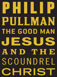
3. Zen theory -
This theory presents a challenge to the human mind that some will
accept and some won't. A zen theory cover mainly involves text
with few images, telling the reader little about the book other than
the name of the author. This is often used for books from well-
known authors, such as Philip Pullman's The Good Man Jesus and
the Scoundrel Christ, who will attract readers with their name alone.
4. Type as image theory -
This theory uses original or customised typefaces to create images
and ideas. The type often becomes the image.
5. Textual plasticity theory -
The human mind reads words as a whole not individual letters. If
a letter is missing, the brain will still understand the word. The
design for James Gleick's Faster has all the vowels missing from the
author's name and title on the cover, but is still readable.
6. Overdetermination theory -
The image on a cover using Overdetermination theory suggests the
beginning or snapshot of a narrative rather than an overall end result.
7. Ringfence theory -
The difference between positive and negative space can determine
what the reader sees. The Rubin vase is a good example, where some
people see two faces and others see a vase. In this cover, the iPod
headphones shape a womb and two lovers' faces.
8. Zoom theory -
Zooming in can give a taster of a narrative without giving too much
away, while zooming out creates a bigger picture, depending on
what is required.
9. Encapsulation theory -
Typeface and image combine to create one unified image for the
reader. Unity is more attractive to humans, as making connections
doesn't require as much effort.
10. Molecular theory -
Layers of symbols that make up a whole, understandable theme define
molecular theory. The cover of Karen Maitland's The Company of
Liars uses skull symbols inside a silhouette of a dog to symbolise that
this is "a novel of the plague".
11. Unheimlich theory -
This theory takes a familiar image or symbol and makes it strange or
unsettling. One cover of Lolita uses the image of a girl's bedroom wall
to represent a girl's legs and underwear.
12. Absent presence theory -
A gap is left on the cover, a missing image or text, that implies
something. By having this space, the reader is forced to fill the gap
with their imagination in order to understand the meaning.
13. Ju Jitsu theory -
The opponent, the cover, forces a view or conception upon the
defender, the reader, such as the bloody, violent implications on the
cover of Anthony McGowan's love story Stag Hunt.
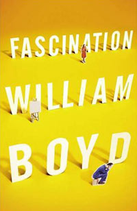
14. Toy theory -
A fixed image allows the reader to remain passive and distance
themselves from a cover. A fluid image, like the one on William
Boyd's Fascination requires the reader to actively explore the cover
and become curious about the content.
15. Obfuscation theory -
If something is hidden it suddenly becomes more interesting to the
curious nature of the human mind.
16. Combination theory -
Because a book is static, two ideas can be presented at once to
create a doubly effective but meaningful image to the reader.
17. Navigation -
The eye is deliberately led via an understandable pattern; left to right,
bottom to top, to create an easily recognizable overall image.
18. Turd theory -
A single, unsightly object can be seen as repulsive. Multiply the
image and use bright colours, and it can become attractive. Usually
used in series design, the effects can be seen in a sequence of Georges
Simenon books designed by Keenan.
19. Maximisation -
Everything is huge and thrown on to the cover. Bigger images and
text can catch a reader's eye in a sea of detailed designs.
20. Fluffy kitten theory -
Nothing draws a reader to a book like a picture of a fluffy kitten.
(Via The Guardian)


No comments:
Post a Comment